PARAMETER REFERENCE
Global Settings
Find the text-wide controls for typography, transforms, color, stroke, shadow, and backgrounds by purpose.
Reset
| Parameter | Description |
|---|---|
| Reset All Characters | Resets the transforms, Margin After, individual color, individual stroke (including Outer Stroke), and individual shadow color for all characters and parts to their default values. In 3D presets, per-character Z Offset / Yaw / Pitch and per-part Z Offset are also reset. |
NOTE
Reset only affects per-character and per-part individual settings. Global Settings (settings applied to the entire text) are not reset.
Text Settings
A group that configures the text content, font, and typesetting (alignment, spacing, and overall scale) together.
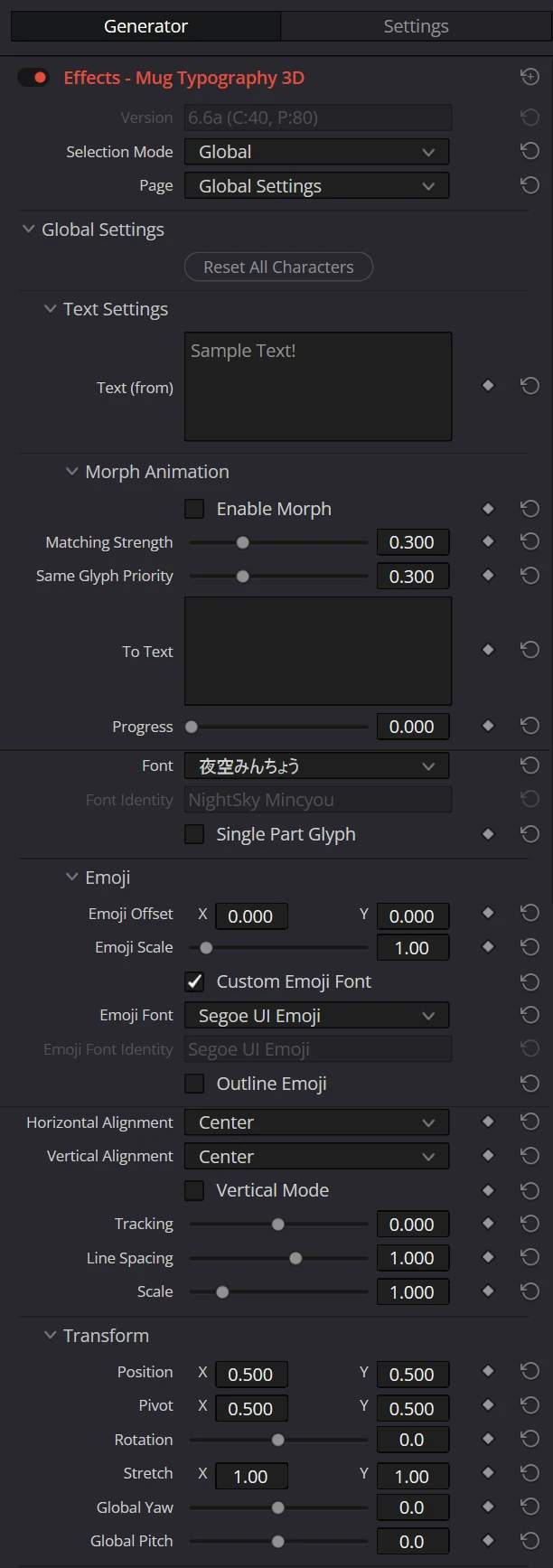
| Parameter | Description | Default |
|---|---|---|
| Text (from) | Enter the text to be displayed. The (from) in the label indicates that this text also serves as the morph source during a morph animation. Max character limit depends on the selected preset (see "Limitations" in the Appendix). For multi-line input, please refer to the note below. | Sample Text! |
| Font | Select the font to use from the list. | - |
| Font Identity | A read-only parameter automatically recorded according to the selected font (it cannot be edited directly). To use a different font on each instance node, deinstance it together with Font (deinstancing only one of them will not restore the correct font). | - |
| Single Part Glyph | Combines all contours of each character into one part. Some fonts build a character from contours that overlap, and with this OFF, translucent text shows those overlaps more opaque than the rest and draws the stroke along the overlaps inside the character. Turn it ON for fades and other translucent text when parts are not moved individually. Keep it OFF to move the pieces of a character separately (Part Settings, part-unit Write On, Morph), since ON makes each character a single part that cannot be split into its pieces. See "Translucent Text" for details. Custom glyphs and color emoji are unaffected; whitespace has no part. Supports ON/OFF keyframes without interpolation. Switching changes part indices, so part effects and Morph may jump. Scripts can override it in OnPreLayout with ctx.global.single_part_glyph (API level 15). | ON: Lite Low / Lite Mid / Lite High / Lite (3D); OFF: all others, including Scripting |
| Horizontal Alignment | Select the horizontal text alignment (Left / Center / Right). | Center |
| Vertical Alignment | Select the vertical text alignment (Top / Center / Bottom / Baseline). · Top: Aligns text relative to the top edge. · Center: Aligns text relative to the center of the ink bounding box (the drawn area). · Bottom: Aligns text relative to the bottom edge. · Baseline: Aligns text relative to the text baseline (prevents vertical shifting when text content changes and stabilizes vertical morph animation). | Center |
| Vertical Mode | When turned ON, text is written vertically. | OFF |
| Tracking | Specifies the global character spacing applied uniformly to all characters, in em units (1.0 = one font size). Positive values widen spacing; negative values narrow it. This value is summed with each character's individual Margin After. | 0.0 |
| Line Spacing | Specifies the line spacing for multi-line text, in em units (1.0 = one font size). | 1.0 |
| Scale | Scales the entire text uniformly. | 1.0 |
NOTE
Multi-line Text Input and Line Breaks
Inputting on the Fusion Page: On the Fusion page, you can type newlines directly by pressing the Enter key to write multi-line text.
Inputting on the Edit Page: Due to Edit page Inspector UI limitations, you cannot type Enter to create newlines directly in the text box. If you want to write multi-line text on the Edit page, insert
\nor<br>at the desired line break positions. These are automatically treated as line breaks.Also note that on the Edit page, pressing Enter while typing may move focus to a different parameter instead of inserting a line break. Be careful not to press Enter unintentionally while typing.
Escaping Line Breaks: If you want to render the literal characters
\nor<br>without breaking the line, prepend them with a backslash to escape them:\\nor\<br>.
| Input in the Text field | Rendered result |
|---|---|
あ\nい | あ い (rendered on two lines) |
あ<br>い | あ い (rendered on two lines) |
あ\\nい | あ\nい (escaped - no line break, shown as a single line) |
あ\<br>い | あ<br>い (escaped - no line break, shown as a single line) |
Emoji
Emoji in the text are drawn automatically with the OS color emoji font (Windows: Segoe UI Emoji, macOS: Apple Color Emoji). The emoji font takes priority even when the text font has the same character. Each emoji (including skin tones and joined emoji) counts as one character and one part.
| Parameter | Description | Default |
|---|---|---|
| Emoji Offset | Moves emoji away from where the font places them, in ems of the font size (Y is positive upward). The advance (the position of the next character) does not change. Use it to correct a font that places emoji off-center. | X0.0Y0.0 |
| Emoji Scale | Sizes emoji as if they were set at this multiple of the font size. The advance changes with it, and emoji scale from the baseline. | 1.0 |
| Custom Emoji Font | When ON, emoji are drawn with the font chosen in Emoji Font below instead of the OS emoji font. Only when this is ON do the three parameters below appear. | OFF |
| Emoji Font | Shown when Custom Emoji Font is ON. Selects the font to draw emoji with. The list is the same as the text Font. When the font cannot be loaded, the OS emoji font is used. | - |
| Emoji Font Identity | Shown when Custom Emoji Font is ON. A read-only parameter automatically recorded according to the selected emoji font (it cannot be edited directly). To use a different font on each instance node, deinstance it together with Emoji Font. | - |
| Outline Emoji | Shown when Custom Emoji Font is ON. When ON, emoji are drawn from the chosen font's outlines and behave like ordinary characters: fill, gradient, texture, stroke, and shadow all apply. They also split into parts like ordinary characters: one part per contour while Single Part Glyph is OFF, and a single part while it is ON. With a color-only font that has no outlines, emoji are not drawn. | OFF |
| Setting | Result |
|---|---|
| OS emoji font (Windows: Segoe UI Emoji) | 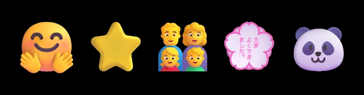 |
| Custom Emoji Font: Noto Color Emoji | 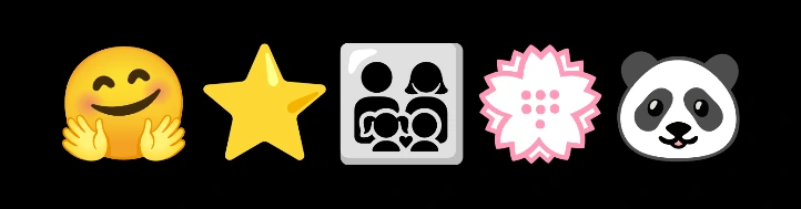 |
| Custom Emoji Font: Noto Emoji Medium + Outline Emoji | 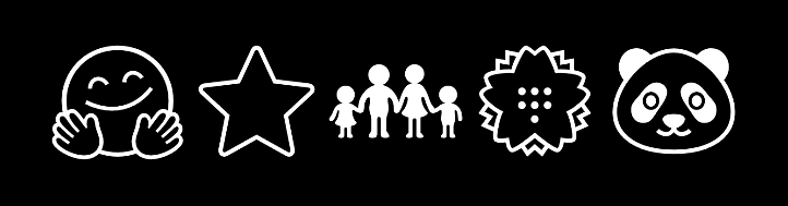 |
Color emoji (when Outline Emoji is OFF) behave as follows.
- Color: The emoji image keeps its own colors. Fill color, gradient, and texture do not apply.
- Opacity: Global, Character, and Part opacity apply. When Transparent Fill is ON, emoji are hidden.
- Stroke and shadow: Emoji get neither.
- Deformation: Path deform effects, the hand-drawn effect, 3D, and morph are supported, and the emoji image deforms with them. In a morph, emoji are not interpolated even with each other: the source emoji disappears and the target one appears.
- Write On, Output Separation, Manual Order: Each emoji is one part, handled like any other character.
NOTE
Supported font formats
| Drawn as | Windows | macOS |
|---|---|---|
| Color emoji | COLR (v0 and v1), PNG images (sbix and CBDT) | Formats macOS can draw (such as the sbix in Apple Color Emoji) |
| Outline Emoji | TrueType and CFF outlines | TrueType and CFF outlines |
Other formats (such as SVG color emoji on Windows) are not supported, and those emoji are left blank.
TIP
Scripts can read and write this group through ctx.global.emoji (API Level 11 or later). Changing any value rebuilds the layout, so avoid animating them every frame.
Morph Animation
In the Inspector, this subgroup sits directly below Text (from) inside Text Settings.
| Parameter | Description | Default |
|---|---|---|
| Enable Morph | Enables morph animation. When ON, the normal text rendering is replaced by a morph from Text (from) to To Text. | OFF |
| Matching Strength | Specifies how strongly the morph refines its part pairings beyond simple spatial proximity. At 0.0, parts are matched based purely on position. Higher values do two things: (1) they consider filled-area similarity, preferring to pair parts with similar painted area (e.g., avoiding a small dot pairing with a full stroke), and (2) they keep a character that has an individual color, stroke, or shadow paired with the character at the same position in the To Text, so its individual styling is not stranded onto an unrelated glyph. | 0.3 |
| Same Glyph Priority | Specifies the strength of pairing identical characters between the start and end texts. At 0.0, characters match purely by position. At 1.0, identical characters are always paired regardless of distance. Identical character pairs slide into place rather than changing shape, keeping the animation clean. | 0.3 |
| To Text | Enter the destination text the morph ends at. Multi-line is supported. | (empty) |
| Progress | Specifies the morph progress from 0.0 (= the Text (from) state) to 1.0 (= the To Text state). Keyframe this value on the timeline to freely control the speed and timing of the morph. Easing is also adjusted via this keyframe curve. | 0.0 |
TIP
Path Deformation effects (Pulse / Trapezoid / Sphere / Barrel) and the Hand Drawn effect can also be layered on top of the morph result.
TIP
You can morph even when the starting and ending texts have a different number of characters (excess characters automatically appear/disappear). However, texts with a similar number of characters and similar shape complexity (part count) morph more naturally and cleanly.
Transform
A group that configures the position, rotation, and stretch applied to the entire text at once.
| Parameter | Description | Default |
|---|---|---|
| Position | Specifies the position of the entire text on the canvas. X is positive to the right, Y is positive upward, and 0.5, 0.5 is the center of the canvas. | X0.5Y0.5 |
| Pivot | Specifies the pivot point for rotation and scaling on the canvas. | X0.5Y0.5 |
| Rotation | The rotation angle of the entire text in degrees (positive is counter-clockwise). You can also enter values beyond ±360° numerically for multiple rotations. | 0° |
| Stretch | Scales the X and Y directions individually. | X1.0Y1.0 |
NOTE
The overall uniform scaling (Scale) is located in the Text Settings group. While Scale changes both X and Y simultaneously, Stretch modifies only one axis, which is useful for distorting text vertically or horizontally.
3D / Scripting Presets Only
In Mug Typography 3D, Mug Typography Lite (3D), and Mug Typography Scripting, the Transform group includes these two additional parameters:
| Parameter | Description | Default |
|---|---|---|
| Global Yaw | Tilts the entire text horizontally around the Global Pivot. Positive values push the right edge away from the camera. | 0° |
| Global Pitch | Tilts the entire text vertically around the Global Pivot. Positive values push the top edge away from the camera. | 0° |
The viewing position and perspective of the scene are configured in Camera Settings.
Color Settings
A group that configures the text fill color, transparent fill, and gradient together.
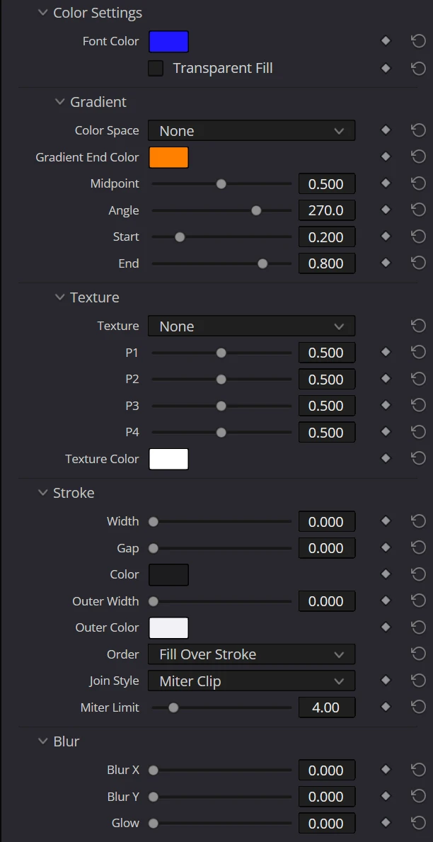
| Parameter | Description | Default |
|---|---|---|
| Font Color | Specifies the base color (RGB + Opacity) for the entire text. | White#ffffff |
| Transparent Fill | When turned ON, the text body (fill) is made fully transparent and only the outline (Stroke) is rendered. To create hollow text, use it with a Stroke Width greater than 0.0. It does not apply to characters or parts that have an individual color (Use Indiv Color). | OFF |
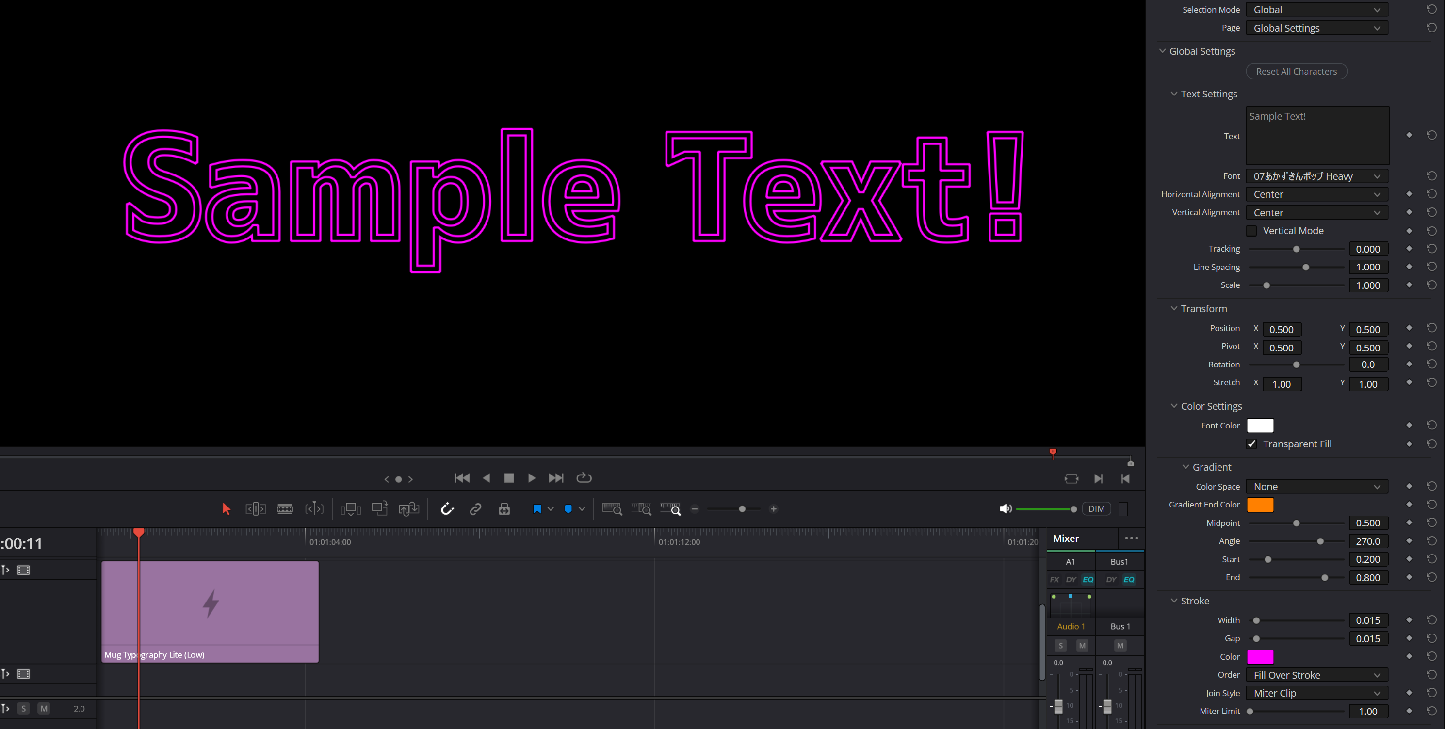 (Example of hollow text created by turning Transparent Fill ON and setting the Stroke Width / Gap.)
NOTE
The Edit page cannot set the alpha value (transparency) of color parameters. See "Limitations" in the appendix for details.
Gradient
A subgroup within the Color Settings group. Applies a gradient to the entire text using Font Color as the start color. The gradient is enabled when Color Space is set to any value other than None (the only exception is Crayon, which draws scribble strokes instead of a gradient; see below).
NOTE
The gradient range is calculated from the bounding box (BB) encompassing all parts at their transformed positions. If any character or part is moved or scaled such that the BB changes, the gradient range shifts across all characters accordingly.
| Parameter | Description | Default |
|---|---|---|
| Color Space | Selects the color interpolation mode for the gradient. None disables the gradient. Okhsv / Okhsl provide perceptually uniform, hue-preserving interpolation. Oklab interpolates based on perceived lightness and color differences. OKLCH_Short / OKLCH_Long interpolate lightness, chroma, and hue along the shorter / longer hue path. Linear RGB uses linear RGB interpolation. Crayon is a special mode that, instead of a gradient, draws hand-scribbled strokes in the end color (Gradient End Color) over the normal fill (see below). | None |
| Gradient End Color | The end color of the gradient (RGB + Opacity). Font Color serves as the start color. | Orange#ff8000 |
| Midpoint | The position of the 50/50 blend point between start and end colors (0.5 = equal split). | 0.5 |
| Angle | The gradient direction in degrees. 0° is left to right, 90° is top to bottom, and 270° is bottom to top. | 270° |
| Start | The gradient start position relative to the bounding box (0 = BB start, 1 = BB end). | 0.2 |
| End | The gradient end position relative to the bounding box (0 = BB start, 1 = BB end). | 0.8 |
Differences in Interpolation by Color Space
Even with the same two colors (start color #0000FF = blue, end color #FFFF00 = yellow), the appearance of the intermediate colors differs greatly depending on the chosen Color Space. Okhsv / Okhsl travel along the hue wheel through vivid intermediate colors (cyan to green), Oklab keeps perceptually uniform lightness, and Linear RGB produces a muddy gray midpoint due to simple numeric interpolation.
| Color Space | Sample |
|---|---|
| Okhsv | 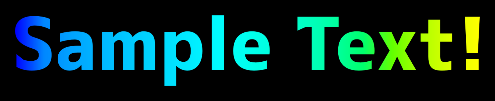 |
| Okhsl | 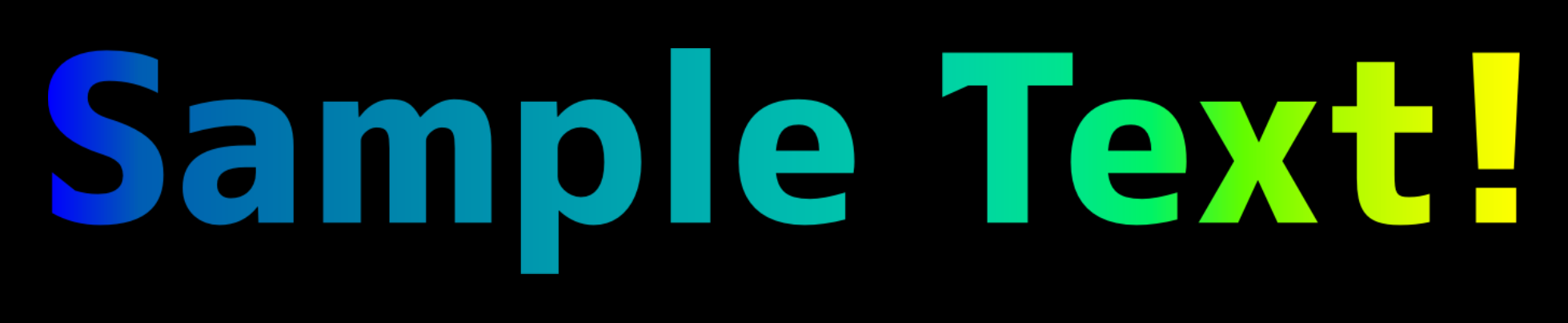 |
| Oklab | 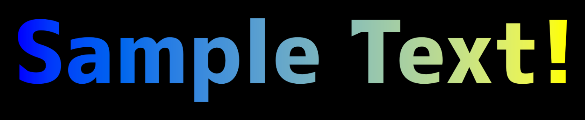 |
| Linear RGB | 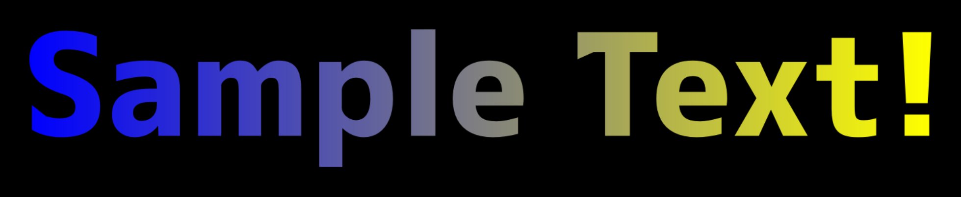 |
Crayon (Hand-Scribbled Fill)
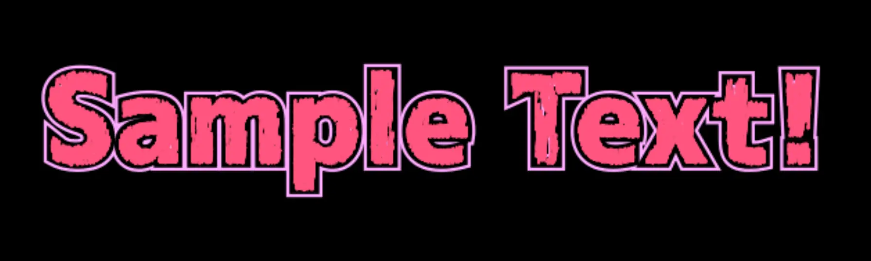
When Color Space is set to Crayon, instead of applying a gradient, hand-drawn scribble strokes in the Gradient End Color are drawn over the normal fill (Font Color). This creates a texture that looks like the text was roughly colored in with a crayon or colored pencil.
In this mode, the gradient parameters are reinterpreted as follows:
| Parameter | Meaning in Crayon mode |
|---|---|
| Gradient End Color | Color of the scribble strokes |
| Angle | Stroke direction |
| Midpoint | Spacing between strokes |
| Start | Stroke thickness |
| End | Outline overshoot and endpoint variation strength |
The strokes retain a strong bias toward the Angle direction while overlapping with varied pigment density and fine wax-like gaps. Increasing End adds small irregularities near the outline and makes occasional strokes extend farther beyond it.
WARNING
While Crayon is active, individual character and part shadow colors are disabled; only Draw Global Shadow and the global shadow color apply. Individual shadow settings are preserved and become effective again after switching to another Color Space.
Texture
A subgroup within Color Settings. It layers a built-in material over the fill to produce looks such as water droplets, an air cushion, glitter, iridescence, faceted surfaces, stained glass, polished metal, stripes, and halftone dots. None keeps the ordinary fill.
| Parameter | Description | Default |
|---|---|---|
| Texture | Selects the material to use: None / Water Droplet / Air Cushion / Glitter / Iridescent / Faceted / Stained Glass / Metallic / Metallic 2 / Stripe / Colored Pencil / Halftone / Halftone Diamond / Prism Foil. Not animated. | None |
| P1 - P4 | Generic controls shared by every material. Their meaning and displayed name follow the selected material (see the table below). | 0.5 |
| P5 | Fifth generic control, shown only when a material that uses it (Iridescent / Metallic / Colored Pencil / Halftone / Halftone Diamond / Prism Foil) is selected. | 0.0 |
| Texture Color | Sets the color of the material. What it applies to depends on the material: the metal flakes for Glitter, the lead for Stained Glass, the stripes for Stripe, the dots for Halftone and Halftone Diamond, the paper for Colored Pencil, the foil for Prism Foil (white is silver), and the added light for the rest. Iridescent ignores it. | White#ffffff |
Control mapping (P1-P5)
The five controls (P1-P5) are generic slots shared by every material, and their displayed names change with the selection (P5 is shown only for the materials that use it).
| Texture | P1 | P2 | P3 | P4 | P5 |
|---|---|---|---|---|---|
| None | P1 | P2 | P3 | P4 | - |
| Water Droplet | Thickness (surface height) | Roundness (profile curvature) | Gloss (reflection strength and sharpness) | Light Angle (light direction) | - |
| Air Cushion | Inflation (bulge) | Seal Width (sealed edge width) | Wrinkles (surface creasing) | Light Angle (light direction) | - |
| Glitter | Flake Size | Highlight Ratio (share of lit flakes) | Flake Amount (number of flakes) | Light Angle (degrees) | - |
| Iridescent | Film Thickness | Hue Range (spread of hues) | Strength | Light Angle (light direction) | Film Variation (unevenness of the film) |
| Faceted | Facets (number of faces) | Bevel Depth | Polish | Light Angle (light direction) | - |
| Stained Glass | Piece Size | Lead Width | Hue Range (spread of hues) | Glow (emission and dimming) | - |
| Metallic | Polish | Relief (surface undulation) | Reflection Contrast | Light Angle (light direction) | Hairline Angle (direction of the brushing) |
| Metallic 2 | Polish | Relief (surface undulation) | Exposure (brightness) | Light Angle (light direction) | - |
| Stripe | Stripe Density | Stripe Width | Strength (how strongly the stripes show) | Stripe Angle (direction the stripes run) | - |
| Colored Pencil | Scratch Density | Scratch Length | Light Amount | Stroke Angle (direction of the scratches) | Light Angle (where the light comes from) |
| Halftone | Dot Density | Dot Size | Fade (how much the dots shrink) | Grid Angle (direction of the grid) | Fade Angle (direction the dots shrink along) |
| Halftone Diamond | Dot Density | Dot Size | Fade (how much the dots shrink) | Grid Angle (direction of the grid) | Fade Angle (direction the dots shrink along) |
| Prism Foil | Tile Size | Hue Range (how much rainbow) | Strength (how much foil) | Light Angle (direction of the light) | Grid Angle (direction of the tiles) |
The displayed range and step change to suit the material: the Light Angle, Stripe Angle, Grid Angle, Fade Angle and Stroke Angle slots show 0-360 degrees, and every other slot shows 0-1. Switching materials never rewrites the stored values, so a value set for the previous material can remain out of range - a Light Angle of 270 left behind in a slot that now runs 0-1, for instance. The material folds such a value into the range it can use, so values that wrap (such as an angle) repeat and values with a limit rest against it. If the result is not what you expected, set the controls again for the material you chose.
Light Angle rotates clockwise in screen space, with the original upper-left direction as 0 degrees. Lighting stays fixed in screen space as normals are adjusted for text rotation and reflection.
What each material looks like
- Water Droplet - Swells each part into a rounded, water-filled surface and lights it with highlights. Raising Gloss tightens the edges of the reflections, and bright reflections keep their gradation instead of collapsing into flat white where they overlap.
- Air Cushion - Looks like a film inflated with air, formed from a sealed edge that follows the outline and a raised chamber inside it. Raising Wrinkles creases the surface.
- Glitter - Dense angular metal flakes catch directional light. Each flake carries its own brightness, so dim flakes, flakes shining in their own colour and burning-white ones are mixed together. Flakes also appear over the stroke.
- Iridescent - Rainbow colors from thin-film interference, with Hue Range setting how far the hue swings. The colors follow the tilt of the letter's surface, and thin strokes carry the rainbow as heavy ones do. Raising Strength lays the interference colors over the fill, so they show on a bright fill too (though a fill close to the film's own color, such as magenta, changes little). Film Variation is how uneven the film is:
0is an even film, and raising it mixes thicker and thinner patches in broad swirls, so the colors flow across flat areas as on an oil slick. The swirls are sized by the character size, so characters of one size share them. Texture Color is ignored, because the colors come from the film itself. - Faceted - Cuts the letter out of flat faces that lean in from its outline, like a letter carved in stone. Each side of the outline has one face, meeting its neighbour along the line that halves their corner and the face opposite along a ridge down the middle of the stroke, all of them straight. Facets is how finely curves are cut: a curve's faces are
0.24times 75% of the character size (1 em) long at0,0.1times at0.5and0.04times from0.8up (a shape uses its longer side). Curves that run on into each other are cut together by that length, so a small bend gets few faces and a long sweep many, and the faces are of one size across the letter. No face bends more than 90°. Above0.7the faces along a curve blend into each other, and at1the curves are smooth with only the ridge down the middle of each stroke left. A straight side is one face at every setting. Every face is tilted by the same amount, set by Bevel Depth. The letter keeps the brightness of its fill overall: faces turned to the light brighten towards Texture Color and faces turned away darken. - Stained Glass - Splits the fill into pieces of colored glass outlined with lead came. See below for details.
- Metallic - A brushed (hairline) finish. The fill color is the metal's own reflectance: ochre reads as gold, light gray as silver, red-brown as copper. Fine brushing scores run across the surface, and the light stretches into streaks across them. Hairline Angle (P5) is the direction of the scores:
0runs along the part's x axis, and higher values turn it clockwise. Raising Polish sharpens the streaks, and raising Reflection Contrast sinks the dark parts for a heavier metal. - Metallic 2 - A chrome (mirror) plating. A bright sky, a sharp horizon and the ground below it are reflected, with a small glint in the sky. Light Angle turns the reflection. Raising Polish sharpens the horizon and the glint, and Exposure (P3) is the brightness of the whole reflection, with
0.5as the standard. The fill color sets the metal, for example#D4AF37for gold,#C0C0C0for silver and#B87333for copper. Texture Color is the color of the light it reflects: it colors only the bright reflections and the highlights, and the darker reflections keep the fill color (white is plain chrome). - Stripe - Lays parallel stripes in Texture Color over the fill. The count is
0.375-60stripes across 75% of the character size (1 em), with5at the default0.5, so characters of one size share one spacing (a shape counts across its longer side). Stripe Width is the share of each period the stripe fills, from no stripe at0to the whole surface at1, and Strength sets how fully the stripe color shows (0leaves the fill). Stripe Angle is the direction the stripes run:0gives diagonal stripes rising to the right,45horizontal and135vertical, and raising it tilts them clockwise on screen. The pattern is centered on the part and moves with it. - Colored Pencil - Looks like colored pencil on white paper. The fill color underneath (Font Color and so on) is the pencil, and thin scratches in Texture Color (the paper, white by default) are scattered at random over that solid fill as the parts left unpainted. The scratches differ a little in length, position and angle, taper at the ends and gather in bundles. Scratch Density is the number of scratches:
0draws none,0.5is 62 rows across 75% of the character size (1 em) and1is 240 (a shape counts across its longer side), so characters of one size share one fineness. Scratch Length is the length of the scratches:0is half the usual and1is twice it. Stroke Angle is the direction the scratches run:0leans the way a diagonal stripe rises to the right, and45runs along the part's x axis. Light Angle is the direction the light comes from on screen:0is the right,90the bottom,180the left and270the top. Just inside the outline facing it, a thin band of even width is left bare. Light Amount sets the width of that band and how many more scratches show on the lit side;0ignores the light. The scratches are fixed per character (part) and do not change from frame to frame. The outline and the border outside it come from the Stroke settings. - Halftone - Lays a grid of round dots in Texture Color over the fill. The count is
1-40dots across 75% of the character size (1 em), with about6at the default0.5, so characters of one size share one spacing (a shape counts across its longer side), and Dot Size is the dot's radius as a share of its cell:0removes the dots and larger values join neighbours. Raising Fade shrinks the dots along a direction set by Fade Angle:0thickens them downwards, and raising it turns that direction clockwise on screen. It is independent of Grid Angle, so turning the grid leaves the fade running down. Grid Angle gives the diamond lattice at0and the square grid at45. The grid and the fade are centered on the part and move with it. P5 is shown only for the materials that read it (the halftones, Colored Pencil, Prism Foil, Iridescent and Metallic). - Halftone Diamond - The same arrangement and controls as Halftone, with diamond-shaped dots. A diamond is drawn with the area of a round dot, so the same Dot Size covers the same share until neighbouring diamonds touch. At a Grid Angle of
0it is an upright square, and at45the diamond's corners sit on the square grid's axes. - Prism Foil - Replaces the fill with foil in Texture Color (the default white is silver). The foil is cut into square tiles, and rays that mirror the light fan out from the centre of each tile together with a rainbow. Tile Size is the side of a tile: against 75% of the character size (1 em) it is
0.05times that length at0,0.45times at0.5and3times at1(a shape uses its longer side), so characters of one size share one tile size. Hue Range is how much rainbow the rays carry;0leaves plain silver. Strength is how much foil:0leaves the fill, about0.63paints the full foil, and above that the glare widens and the rays facing away from the light light up too. Light Angle is the direction of the light on screen; it stays put when the part turns, so turning the part changes which rays catch it. Grid Angle is the direction the tiles run,0along the part's x axis. The tiles are centred on the part and move with it. Once a tile is smaller than about two pixels on screen, its rays can no longer be told apart and the foil is painted in its average color.
Glitter in detail
- Setting Flake Size to
0does not make the flakes as fine as possible - the flakes disappear entirely. Raising it makes them larger and spaces them further apart. - Highlight Ratio sets the share of flakes that glint white:
0has none,1lights every flake white. The other flakes shine in their own colour the more they face the light, and spill a glow of that colour. Density and placement stay fixed. - Flake Amount controls all flakes, including unlit ones:
0removes flakes and glow,1keeps full density. Remaining flakes retain their positions, sizes and colours. - Light Angle rotates the light in degrees. Flakes stay fixed while their reflections change; animate it with keyframes.
- Texture Color sets the metal colour. The strongest reflections approach white.
Lit flakes have a near-white core and a soft glow. Glow stays within the text outline and follows Highlight Ratio.
Stained Glass in detail
- Piece Size is a ratio relative to the untransformed character size.
0-1corresponds to roughly 6-45% of the character size (1 em), so characters of one size carry pieces of one size (for a shape, roughly 8-60% of its longer side). - Setting Lead Width to
0removes the lead and lets the pieces meet each other directly. The lead takes its color from Texture Color, so the default white produces white lead. - Hue Range spreads each piece's hue up to ±180° × P3 from the hue of the fill. At
0the pieces keep the fill's hue; at1every hue is allowed and the minimum saturation and brightness rise too, so even a gray fill becomes vividly multicolored. - Glow is centered at
0.5, which is plain glass. Raising it makes the pieces emit, spreading colored transmitted light and a soft shine through the inside of the character; lowering it drains the light out of them, like looking through a window into an unlit room. Dimming preserves the hue and the fill's opacity, so the glass never reads as an opaque black hole. The reflection direction is fixed. - The division and each piece's color follow the character through scaling, rotation, yaw, and pitch.
- Outline curves are straightened according to the size of each piece, so larger pieces look angular while smaller ones stay closer to the original curve. Tiny slivers are avoided, thin strokes keep a piece length suited to their width, and small separate parts are left whole rather than divided.
How textures interact with other settings
A material does not replace the fill - it is layered on top of it (except Prism Foil, which replaces the fill with the foil and lets it show through only when Strength is lowered). Font Color, the gradient, and individual character or part colors all stay visible underneath, so the color you choose affects the result. Glitter derives its metal colour from Texture Color; Stained Glass derives its glass hues from the underlying fill.
Color opacity applies as well, so a fainter fill produces a fainter material. Turning on Transparent Fill, however, removes the fill entirely and therefore the material with it (characters and parts using an individual color are exempt from Transparent Fill, so the material remains on those).
Preview in MT Sim
In the MT Sim preview (VSCode extension), textures are drawn as a simplified hint of the result. The choice of material and the effect of each control can be checked there, but the actual surface and shading are not reproduced. Always confirm the final appearance in the plugin itself.
Outline (Stroke)
Renders the outline (stroke) of the text glyphs. Useful when you want to keep text legible over busy backgrounds, or to give characters a bold, outlined look.
TIP
To make the outline visible, first set Width to a value greater than 0.0. The outline is not rendered while it remains at 0.0.
| Parameter | Description | Default |
|---|---|---|
| Width | Specifies the thickness of the outline as a ratio to the font size (e.g., 0.05 is about 5% of the character height). It does not scale with transform or stretch scaling. Setting it to 0.0 disables outline rendering. | 0.0 |
| Gap | Specifies the width of the gap between the fill and the outline (stroke) as a ratio to the font size. When set greater than 0.0, the area between the text body and the outline is cut out, producing a three-layer "detached outline" look (body, gap, outline). | 0.0 |
| Color | Specifies the color of the outline (RGB + Opacity). | Off-black#1c1c1e |
| Outer Width | Specifies the outer outline thickness as a ratio to the font size. It renders independently when Width (Inner Stroke) is 0.0, and Gap is then applied between the text fill and Outer Stroke. | 0.0 |
| Outer Color | Specifies the color of the outer outline (RGB + opacity). | Cool white#f2f2f7 |
| Order | Specifies the draw order of the stroke and fill. Fill Over Stroke draws the fill on top of the stroke, so only the outer half of the stroke is visible, creating an outside-stroke effect. Stroke Over Fill draws the stroke on top of the fill, causing it to overlap the glyph and appear to bite inward. Fill Over Stroke (Per Character) produces the same stacking as Fill Over Stroke, but completes each character before starting the next. | Fill Over Stroke |
| Join Style | Specifies the join style for the corners of the stroke. · Miter Clip: Miter join. Sharpens corners. · Round: Rounds corners. · Bevel: Flattens corners (beveling). · Miter Round: Produces the same result as Miter Clip. · Miter Bevel: Produces the same result as Miter Clip. | Miter Clip |
| Miter Limit | The limit value for corner sharpness in miter joins. Sharper angles result in longer miter lengths, and a corner past this limit is flattened. The limit itself still applies, but Join Style can no longer choose what happens once it is exceeded. | 4.0 |
WARNING
The three miter styles are not distinctMiter Clip, Miter Round, and Miter Bevel all render as the same miter join, so choosing between them makes no difference (a corner past the miter limit is always flattened). Round and Bevel work as described. The two redundant entries are scheduled for removal in a future version.
Join Style Samples
| Join Style | Sample |
|---|---|
| Miter | 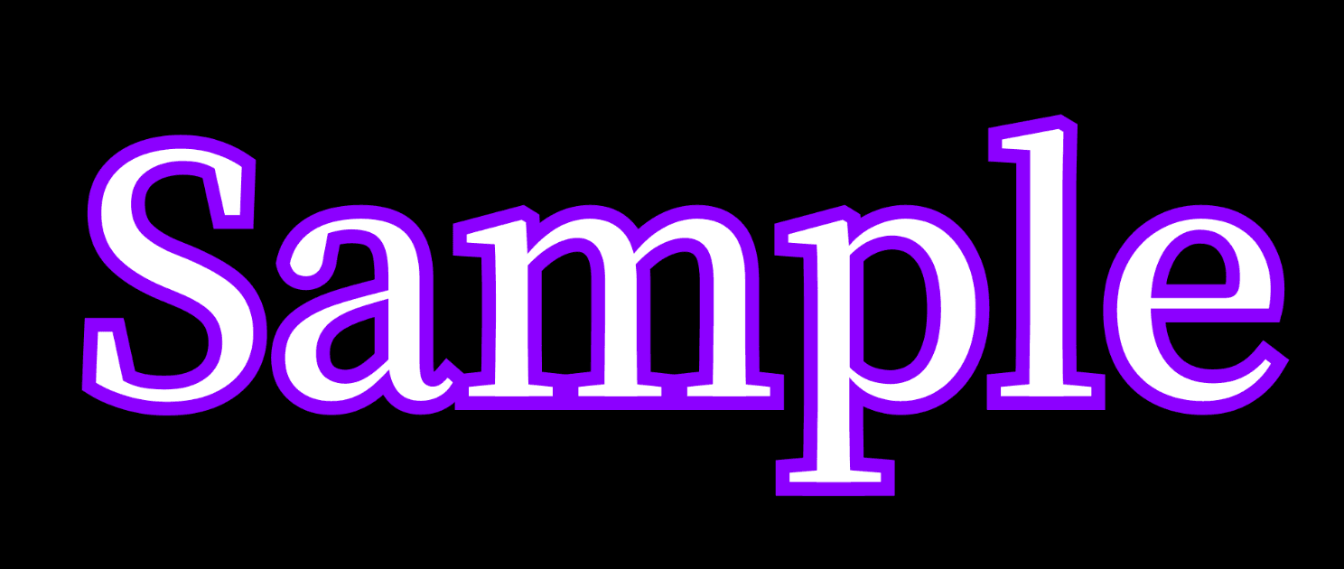 |
| Round | 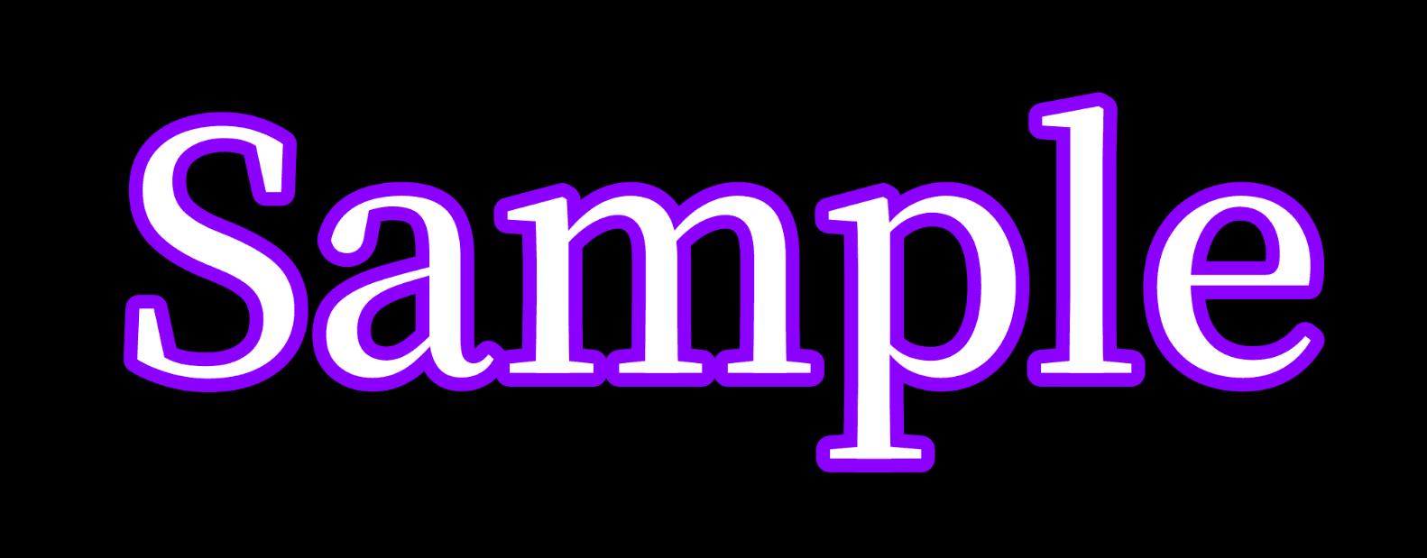 |
| Bevel | 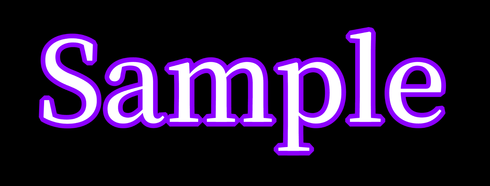 |
Draw Order (Order) Samples
| Draw Order | Sample |
|---|---|
| Fill Over Stroke | 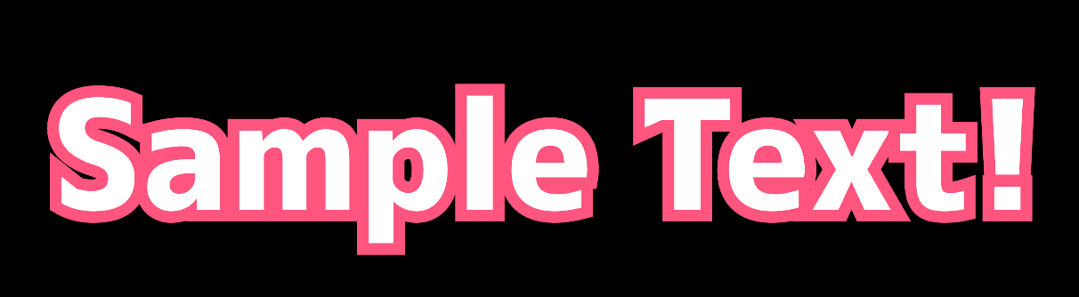 |
| Stroke Over Fill | 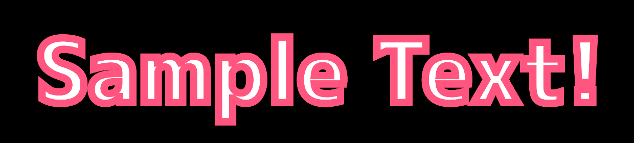 |
Fill Over Stroke (Per Character) differs from Fill Over Stroke only where characters overlap. Plain Fill Over Stroke draws every character's stroke first and then every character's fill, so an overlapping character can lay its stroke over the fill of the character in front of it. Per character, one character's stroke and fill are finished before the next character begins, so each character ends with its own stroke hidden under its own fill and the characters keep their front-to-back relationship. A later character's gap can no longer cut into an earlier one either. With a layout whose characters do not overlap, the two look identical. Frames with 3D projection enabled always draw per character.
Blur Settings
Blurs the text itself: the fill, gradient, texture and stroke together. The shadow and the bounding box are not blurred by this setting. The shadow has its own blur in Shadow Settings.
| Parameter | Description | Default |
|---|---|---|
| Blur X | Specifies the horizontal blur in font sizes (1.0 = one font size). 0.0 leaves the horizontal edges sharp. | 0.0 |
| Blur Y | Specifies the vertical blur in font sizes (1.0 = one font size). 0.0 leaves the vertical edges sharp. | 0.0 |
| Glow | Brightens the blurred text into a glow. Higher values make the glow brighter and denser, and a saturated core turns toward white. It has no effect while the text is not blurred. | 0.0 |
| Setting | Sample |
|---|---|
| Blur X / Y (blur only) | 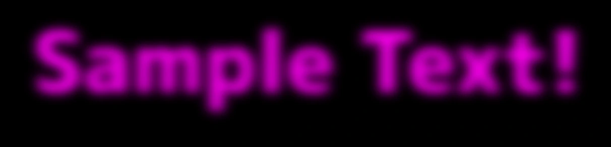 |
| Blur X / Y + Glow | 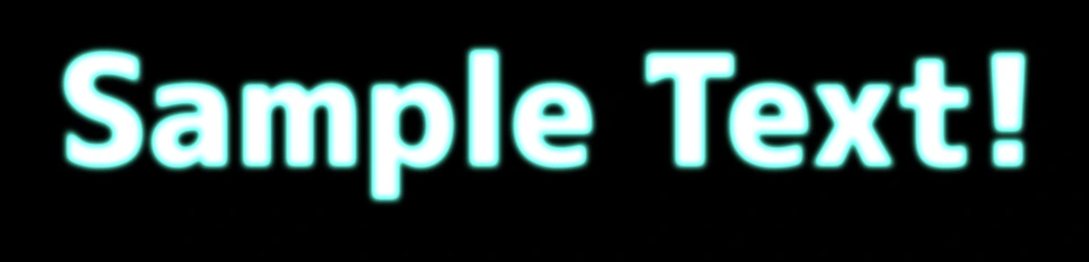 |
Shadow Settings
Renders a drop shadow for the entire text. Useful when you want to make the text stand out from the background with a sense of depth, or to improve legibility.
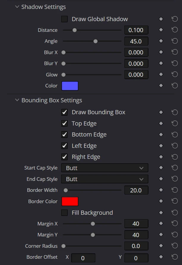
| Parameter | Description | Default |
|---|---|---|
| Draw Global Shadow | Enables the global drop shadow that renders a shadow for all characters. The parameters below are always visible, but they only take effect while this is ON. Note: A character with an individual shadow color (Use Indiv Shadow Color) set on the Character Settings page casts a shadow even when this global shadow is OFF. | OFF |
| Distance | Specifies the shadow offset distance in font sizes (1.0 = one font size). The distance is measured on each part itself, so the shadow keeps the same distance from the text under any Scale, Stretch, rotation or 3D perspective; the direction set by Angle stays fixed on the canvas. | 0.1 |
| Angle | Specifies the shadow direction in degrees. 0° is right, 90° is downward. | 45° |
| Blur X | Specifies the horizontal blur of the shadow in font sizes (1.0 = one font size). 0.0 leaves the horizontal edges sharp. | 0.0 |
| Blur Y | Specifies the vertical blur of the shadow in font sizes (1.0 = one font size). 0.0 leaves the vertical edges sharp. | 0.0 |
| Glow | Brightens the blurred shadow into a glow. Higher values make the glow brighter and denser, and a saturated core turns toward white. It has no effect while the shadow is not blurred. | 0.0 |
| Color | Specifies the shadow color (RGB + Opacity). | Blue#5555ff |
| Setting | Sample |
|---|---|
| Sharp shadow (no blur) | 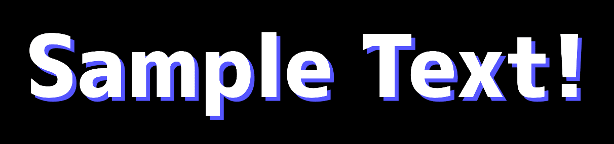 |
| Blur X / Y (blurred shadow) | 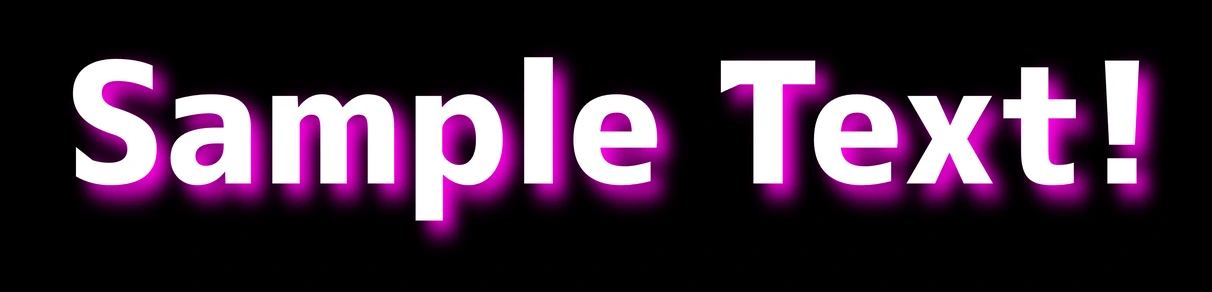 |
| Blur X / Y + Glow (glowing shadow) | 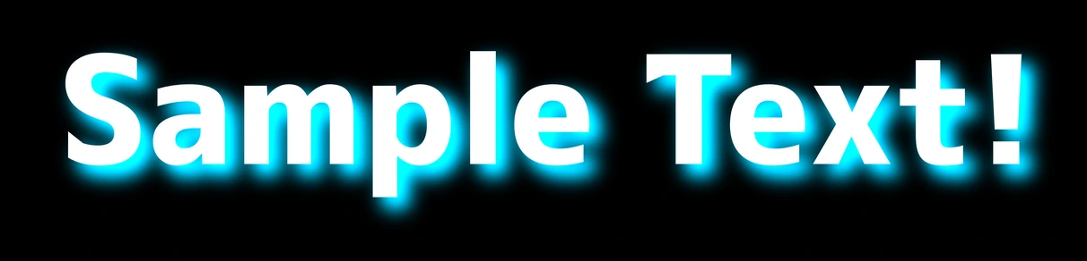 |
Bounding Box Settings
Configures rendering and filling of the bounding box (background frame) surrounding the entire text. Useful when you want to add a backing bar behind subtitles, or frame the text to give it a lower-third / telop look.
NOTE
The bounding box (BB) is the smallest rectangle that encloses all characters and parts. When you move characters or parts individually, the size and position of the BB updates accordingly. In 2D, the box rotates together with Global Rotation (measured from the text bounds before that rotation); in 3D, its fill and border follow the same camera projection and near-camera depth clipping as the text.
| Parameter | Description | Default |
|---|---|---|
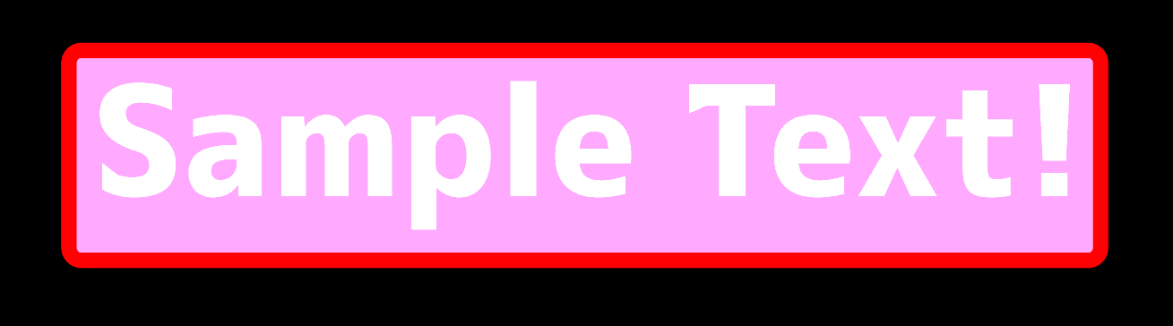
| Draw Bounding Box | Enables drawing of the bounding box background and borders. When turned ON, the following parameters appear. | OFF |
| Top Edge / Bottom Edge / Left Edge / Right Edge | Specifies whether to draw the top, bottom, left, and right edges individually. | ON (all edges) |
| Start Cap Style / End Cap Style | Specifies the end cap style of the stroke when drawing open paths (e.g., L-shape with 3 or fewer edges). Options: Butt (flat), Square (square), Round (round), Round Rev (reversed round), Triangle (triangle), Triangle Rev (reversed triangle). | Butt |
| Border Width | Specifies the border width as a percentage of the font size. | 20.0 |
| Border Color | Specifies the border color. | Red#ff0000 |
| Fill Background | Specifies whether to fill the inside of the box with the background color. When ON, the background is rendered behind the glyphs and Fill Color / Fill Opacity / Fill Offset appear. | OFF |
| Fill Color | Specifies the background fill color (RGB + opacity). | Light Purple#ffaaff |
| Fill Opacity | Specifies the opacity of the background fill (0.0 = completely transparent, 1.0 = completely opaque). | 1.0 |
| Margin X / Margin Y | Specifies the margin on the sides (X) and top/bottom (Y) as a percentage of the font size. Negative values can be used to draw the border inside the text boundary. | 40.0 |
| Corner Radius | Specifies the radius for rounding the bounding box corners as a percentage of the font size. It always applies to the background fill. For the border, it takes effect only when all of the Top / Bottom / Left / Right edges are ON; with any edge OFF, the border is drawn with square corners. | 0.0 |
| Border Offset | Offsets the border rectangle in the X / Y directions, as a percentage of the font size. The fill rectangle stays in place, letting you shift only the border for offset frame designs. | X0.0Y0.0 |
| Fill Offset | Offsets the background fill rectangle in the X / Y directions, as a percentage of the font size. The border stays in place, letting you shift only the background. | X0.0Y0.0 |
ReferenceView full Inspector screenshots on this page