COLOR & GRADIENT
Beautiful Results with Any Combination
Interpolating in perceptual color spaces like Oklab keeps midtones clean and vivid, so you can blend any two colors without muddy gray transitions.
- Perceptual color spaces
- Flexible direction and range
- Natural intermediate colors
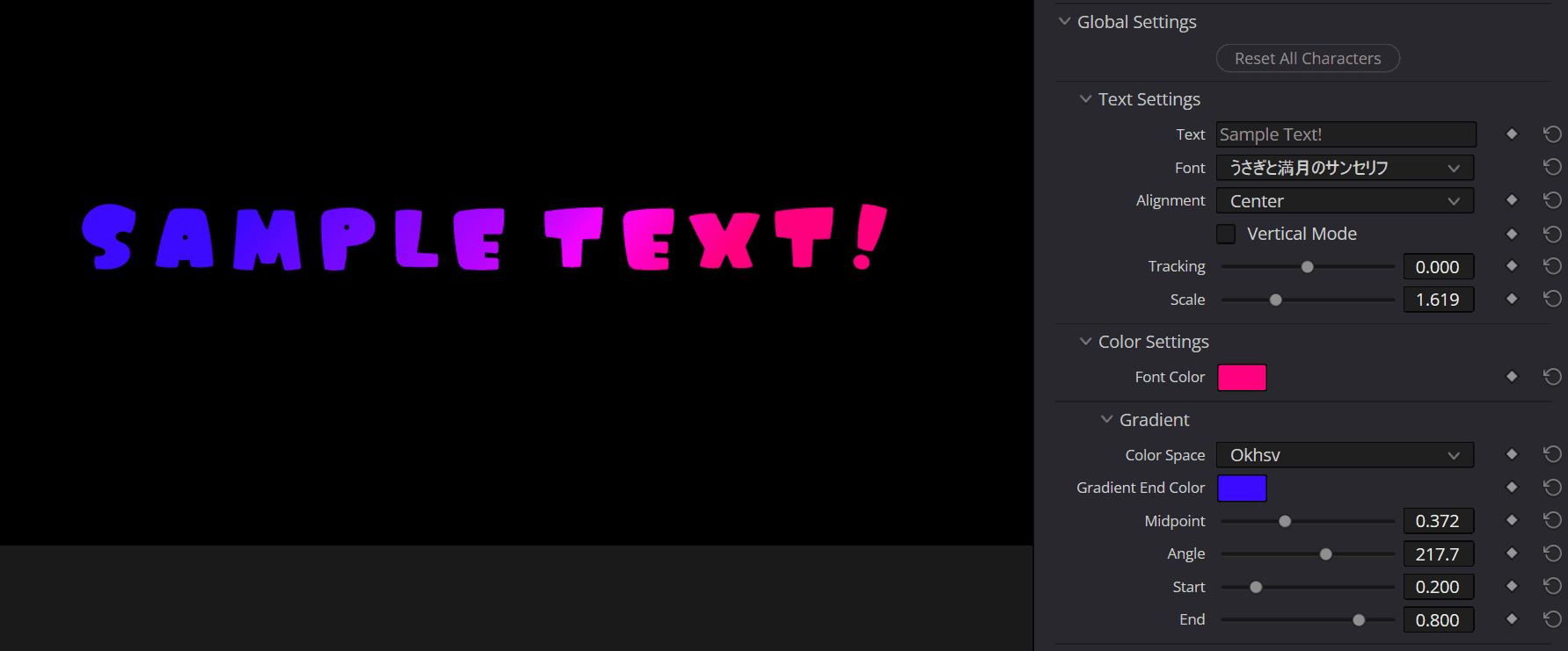
How to Use
- Set Page to
Global Settings. - Choose the starting color with Font Color in Color Settings.
- Set Color Space in Gradient to an option other than
None, such asOklab. - Choose the ending color with Gradient End Color.
- Adjust the direction with Angle, and the range over which the colors transition with Start / End.
TIP
For a natural-looking result, start by trying Color Space set to Oklab and leaving Midpoint at 0.5.
Differences Between Color Spaces
Even with the same two colors, the path the intermediate colors take changes depending on the Color Space.
| Color Space | Interpolation Result | Intermediate Colors |
|---|---|---|
Oklab | 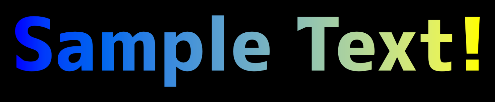 | Perceptually uniform lightness - colors blend naturally without turning muddy |
Okhsl | 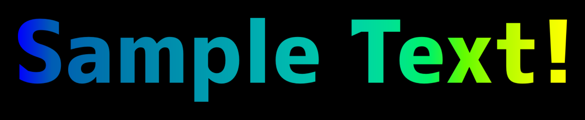 | Travels along the hue wheel while preserving the impression of saturation and lightness |
Okhsv | 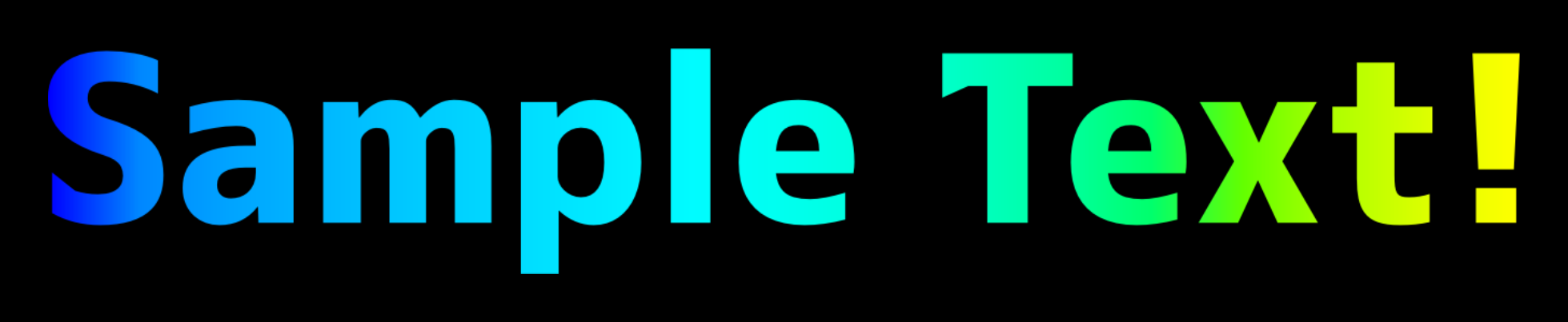 | Travels along the hue wheel and preserves vividness the most |
OKLCH_Short | 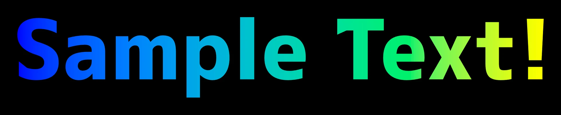 | Interpolates lightness, chroma, and hue along the shorter way around the hue wheel |
OKLCH_Long | 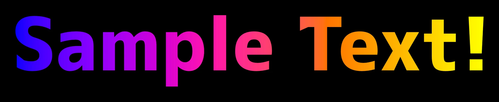 | Interpolates lightness, chroma, and hue along the longer way around, passing through more hues |
Linear RGB | 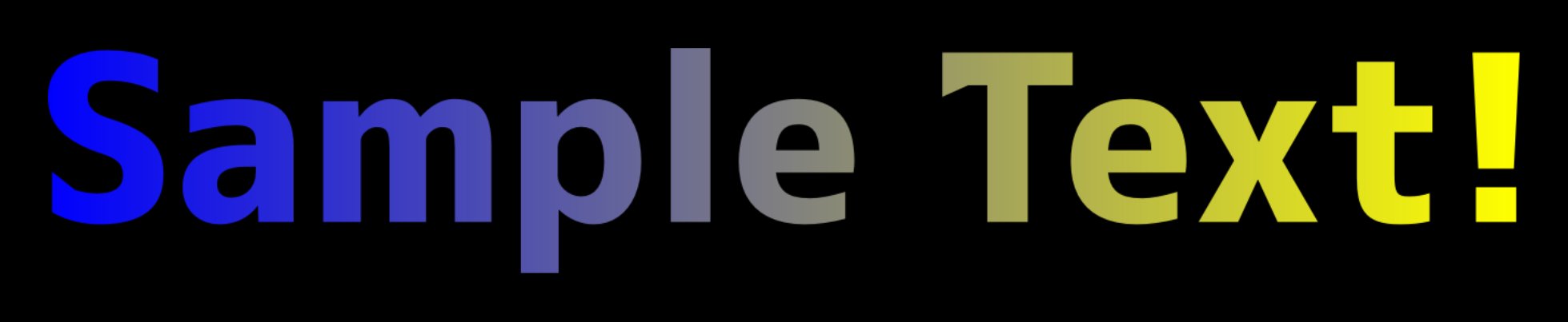 | Simple numeric interpolation - midpoints tend to drift toward muddy gray |
TIP
If the intermediate colors look dark, start with Oklab. If the path taken through the hues matters most, start with Okhsl or Okhsv and adjust from there.
Crayon Scribble Fill Experimental
Setting Color Space to Crayon draws hand-scribbled strokes in the Gradient End Color over the normal fill (Font Color) instead of applying a gradient. This creates a texture that looks like the text was roughly colored in with a crayon or colored pencil.

TIP
When using Crayon, making the base fill transparent leaves only the scribble strokes, which brings out the crayon-like texture. Either set the opacity of Font Color to 0 or turn on the dedicated Transparent Fill - whichever you prefer. The sample image above also uses a transparent base fill.
In this mode, the gradient parameters are reinterpreted as follows:
| Parameter | Meaning in Crayon mode |
|---|---|
| Gradient End Color | Color of the scribble strokes |
| Angle | Stroke direction |
| Midpoint | Spacing between strokes |
| Start | Stroke thickness |
| End | Outline overshoot and endpoint variation strength |
WARNING
Crayon is an experimental feature. Its texture and parameter behavior may change in future versions. While Crayon is active, individual character and part shadow colors are disabled; only Draw Global Shadow and the global shadow color apply. It can also be used in 3D presets, but the scribble pattern changes every time you move the camera or the characters/parts.
See Crayon (Hand-Scribbled Fill) for details.